SPINR - iPaaS
SPINR is a superfast, cloud-based, integration platform, providing real-time data and insight to any organization. It helps businesses leverage their existing legacy data silos to create unified data views across their estate.
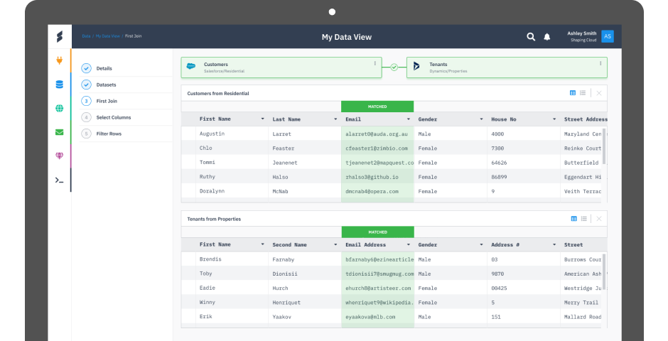
SPINR is a superfast, cloud-based, integration platform, providing real-time data and insight to any organization. It helps businesses leverage their existing legacy data silos to create unified data views across their estate.

There are many big players in the data integration space, Dell Boomi, Mulesoft and Google Cloud Dataprep to name but a few but they are absolute monstrosities of complexity for the average user.
We had to be careful how we positioned ourselves in the market. We wanted to carve out a new type of data sharing tool that allowed effortless sharing of data that in turn opened up a raft of opportunities for developers to create amazing apps and services.
Notable challenges were:
As lead product designer I worked alongside the SPINR development team, the design process involved the following steps:
One of the biggest challenges for SPINR was identifying who our solution would be for. After speaking to numerous customers it became clear that this was a platform aimed at both CIO level and developers.
Developers wanted a platform to help them speed up the integration between the systems they were being asked to connect to. Typically a developer would spend a lot of time writing API’s to make the connection between 2 or more systems.
CIO’s on the other hand who didnt have the budget to hire a lot of IT resource wanted a simple platform to do the integration themselves. All the CIO cared about was the actual sharing of data.

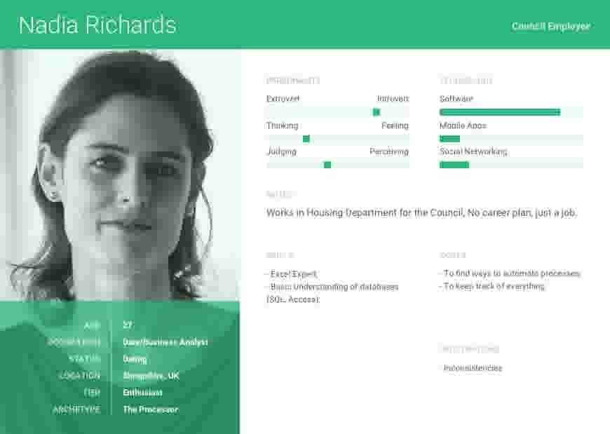


A challenging aspect of getting the MVP off the ground was deciding what to work on, when and how much resource to dedicate to each feature.
I ran heuristic analysis sessions to determine what was the most critical things we’d tackle first.


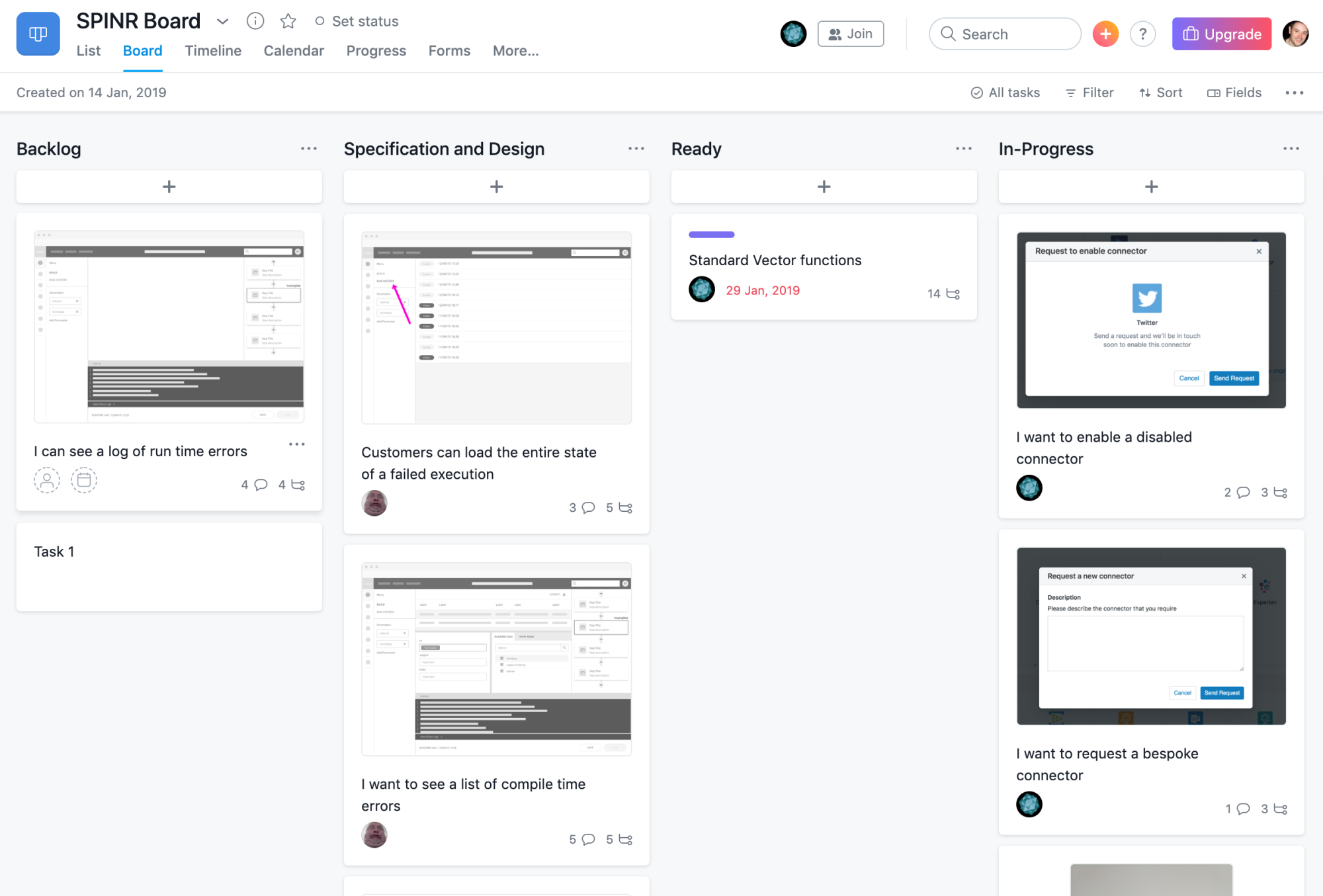
The team adopted a lean, iterative process that was managed through the collaboration tool Asana. Key tasks were taken from the project plan and input into Asana, colour-coded and assigned to members of the project team.
Asana was then used as a central point of communication and feedback on each task.

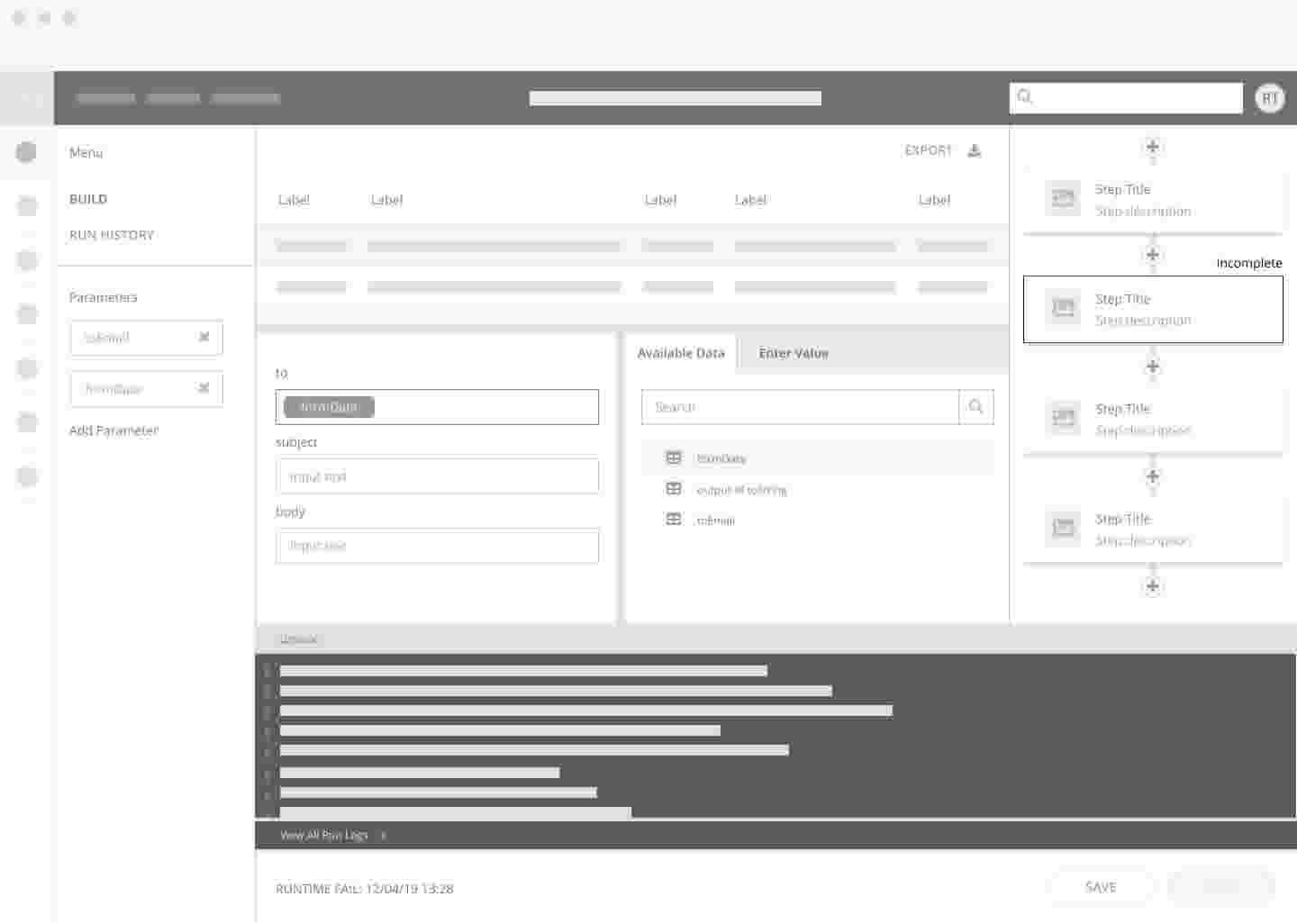
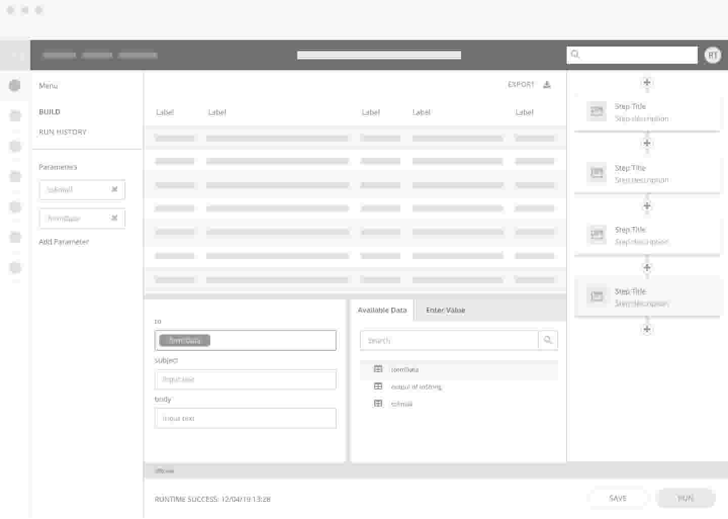
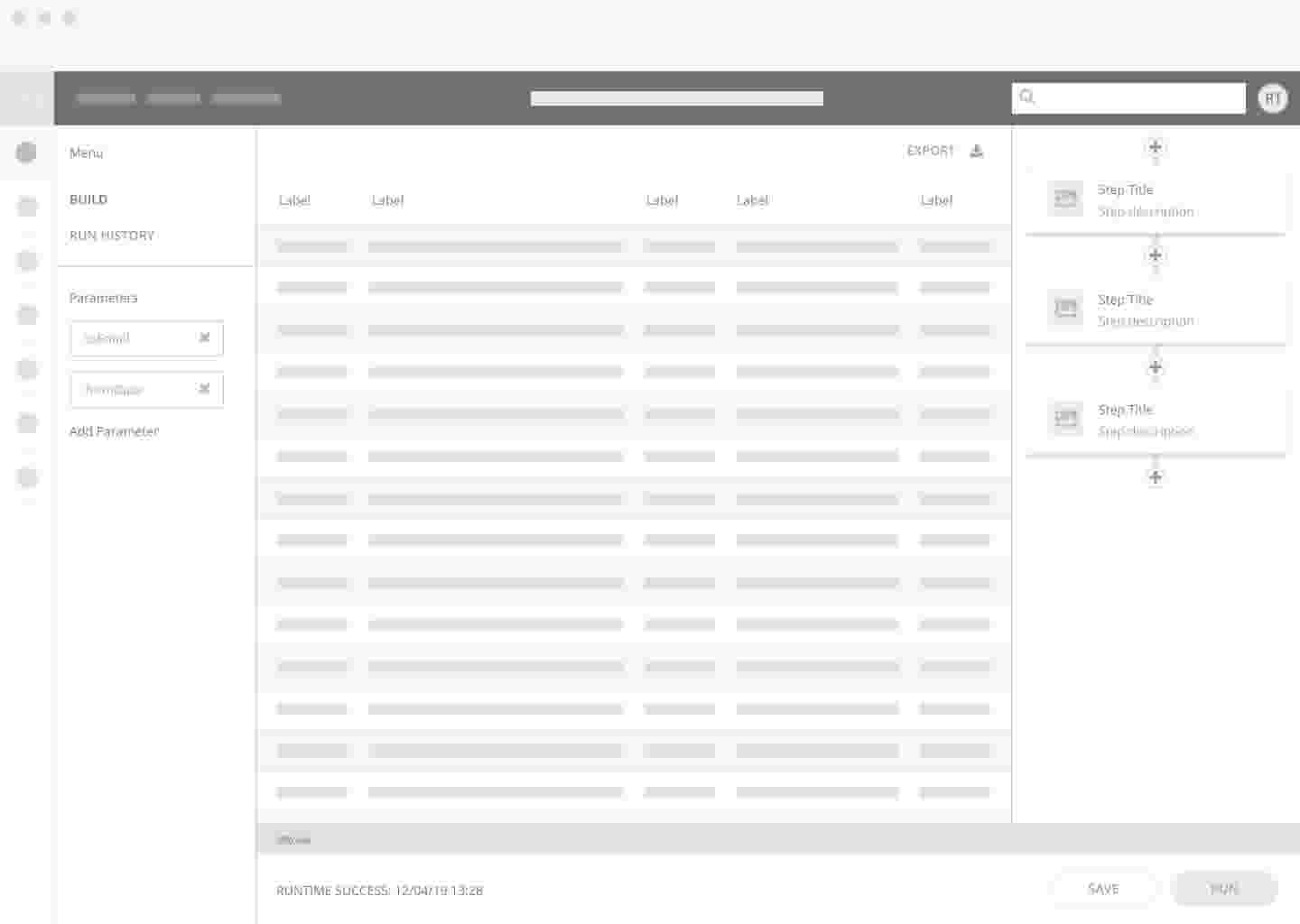
There was a huge amount of discovery work needed to define exactly how users would traverse each feature of the app. I spent some time working out the core part of the MVP, the data wizard screens.
The user would go through a series of steps to join one or more datasets. Of course, the source data might not always be in a valid state for joining. We introduced a way and provided a simple set of data wrangling tools so users could cleanse their data to get it ready for joining. This all needed exploring and designing and I was responsible for the output of these flows.


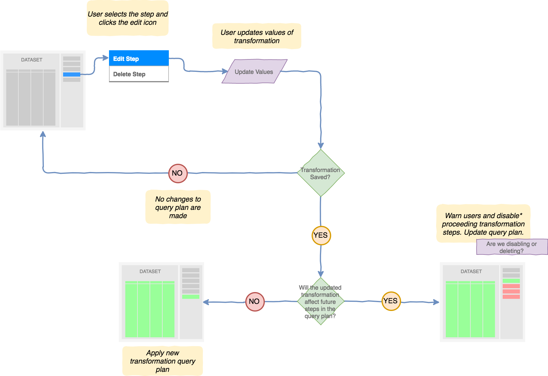
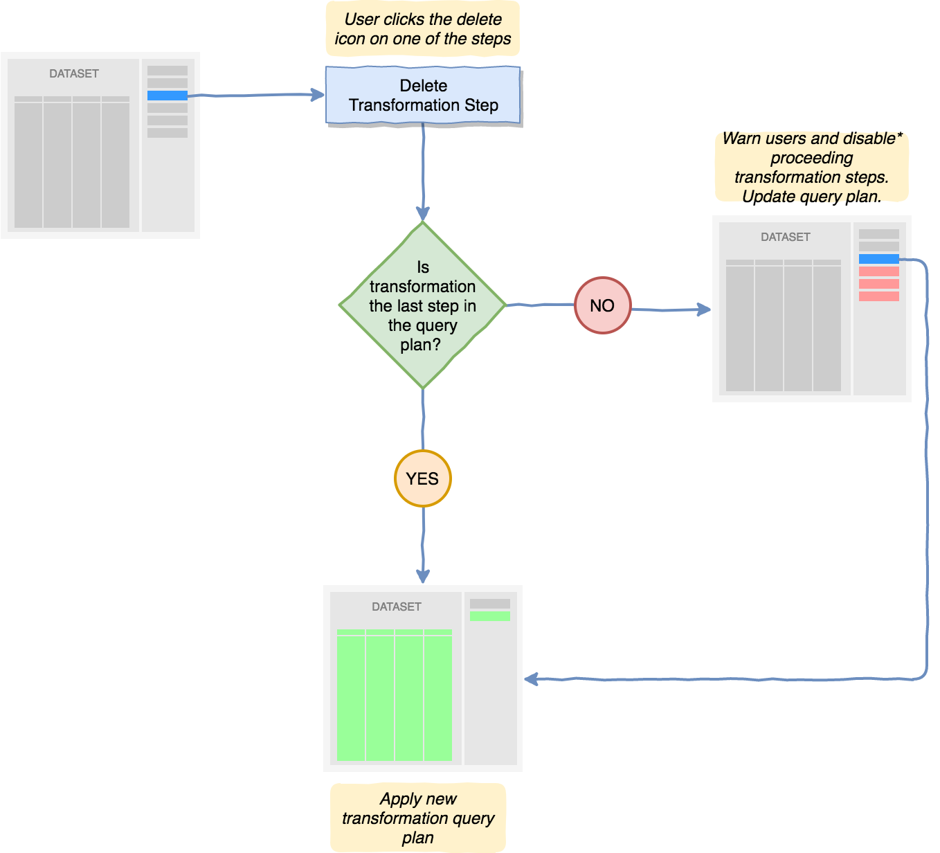
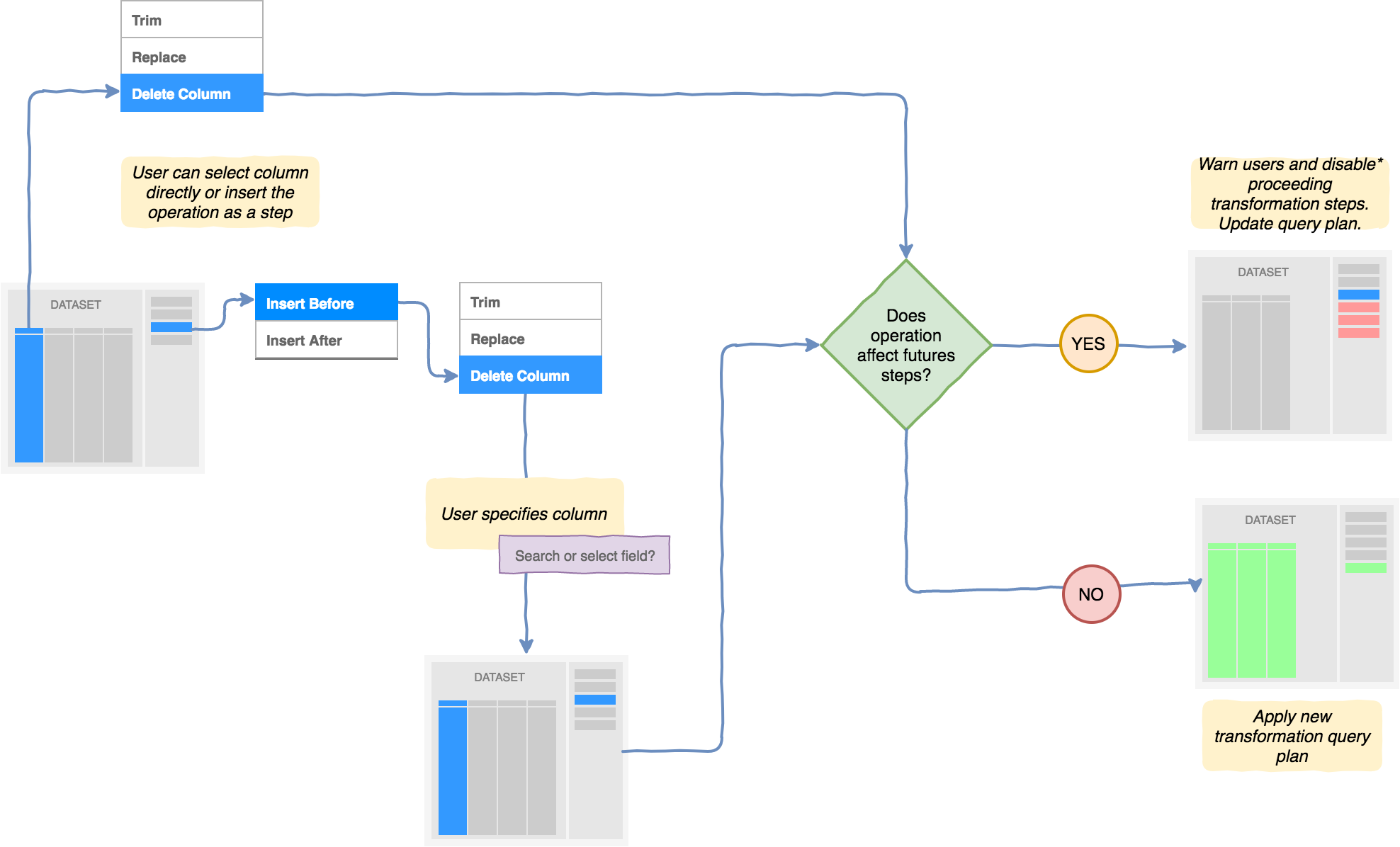
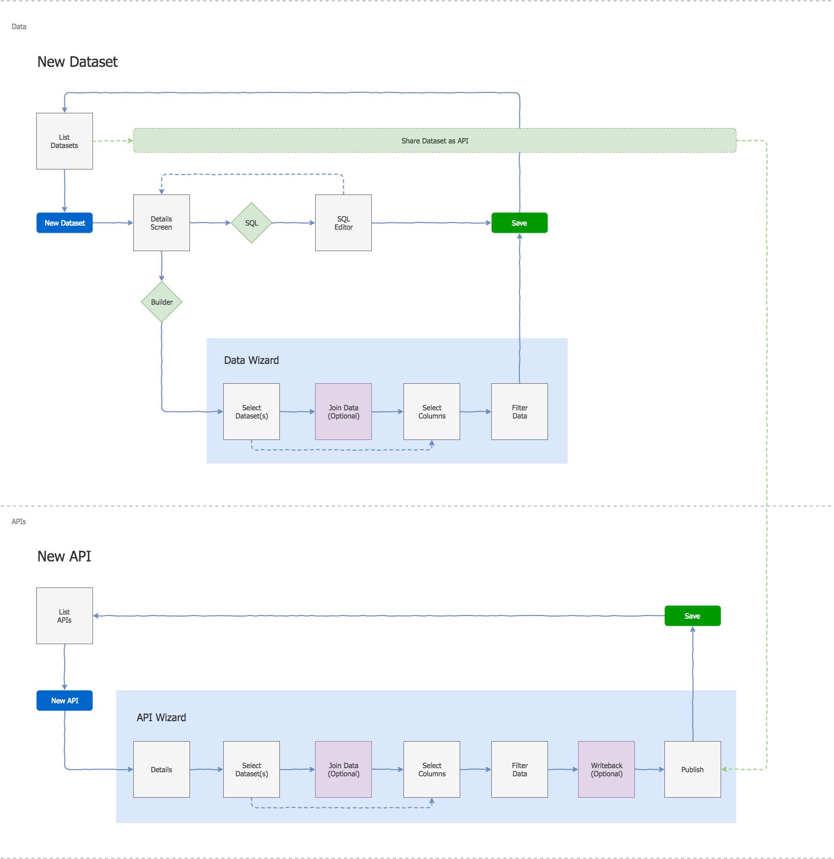
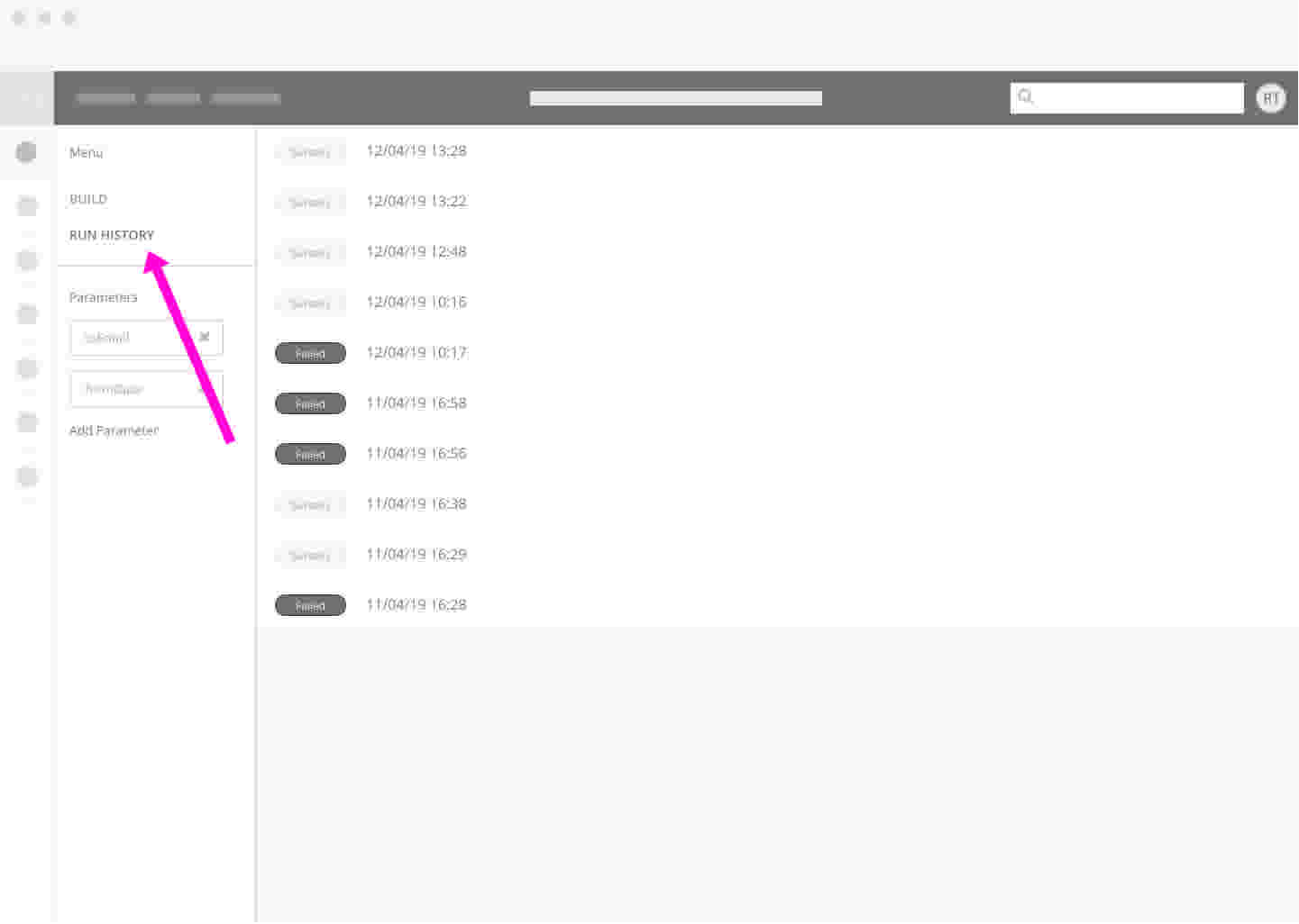
I produced a plethora of wireframes for SPINR during my time on the project, each detailing exactly how a feature would work. I worked directly with the CEO and CTO directly during design sessions to work out an approach that was both feasible technically and realistic given timescales.
When the opportunity arose, I’d also speak with prospective customers to validate my ideas. These would usually be in the form of clickable prototypes.
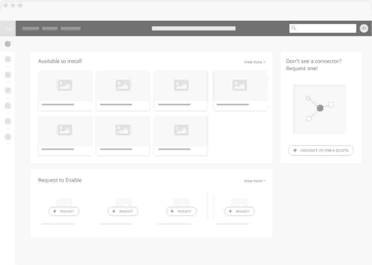
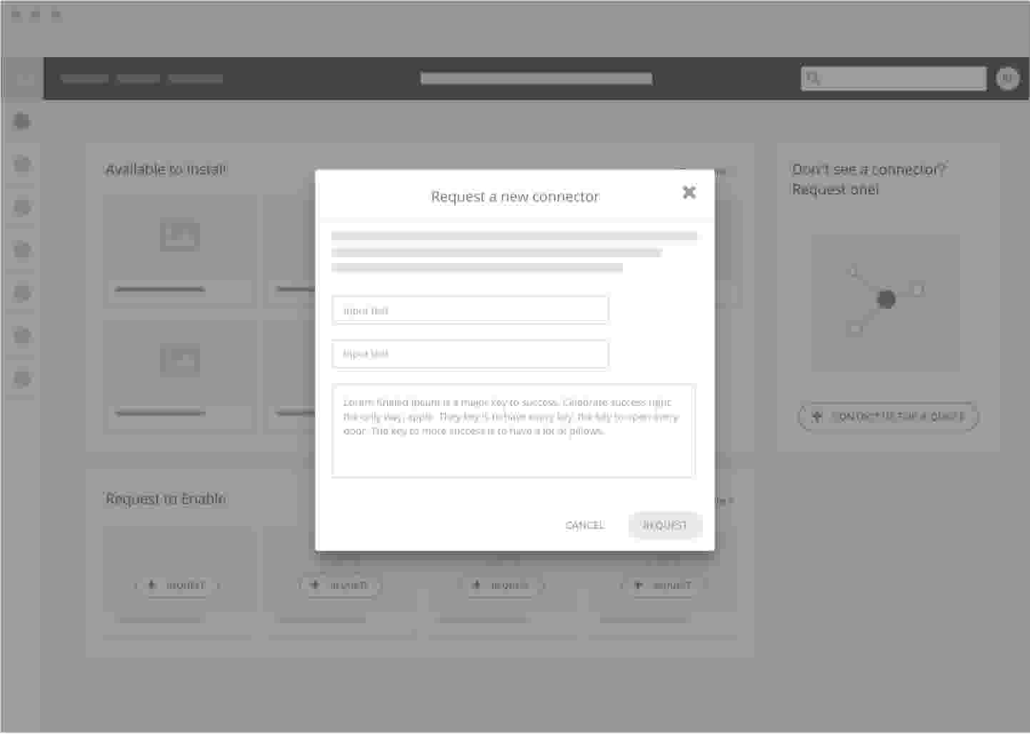
It was important for SPINR to not only function well, but look the part too. We were up against some really innovative competitors in our space.
It was my job to make sure the UI stood the test of time. I used my visual skills to carve out a great looking UI. The first port of call was working up a brand and defining a UI design library.
If you want to see the brand in more detail, feel free to look through the brand guidelines I created.


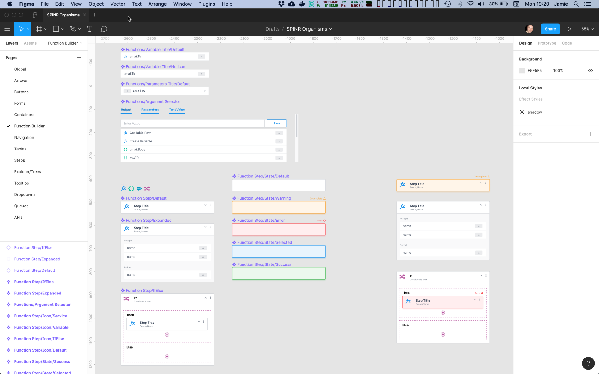
Here you can see I’ve integrated the design library to really make the app easier on the eyes. Re-use of components. Use of colour, space and clean typography gives the app a premium modern feel.
I worked closely with the front end developer and we collaborated on the design library and how it should be implemented. Components were built in the React framework, this was great as the design tool I used (Figma) allowed me to ingest the react components directly into my designs. This sped up the front end delivery.


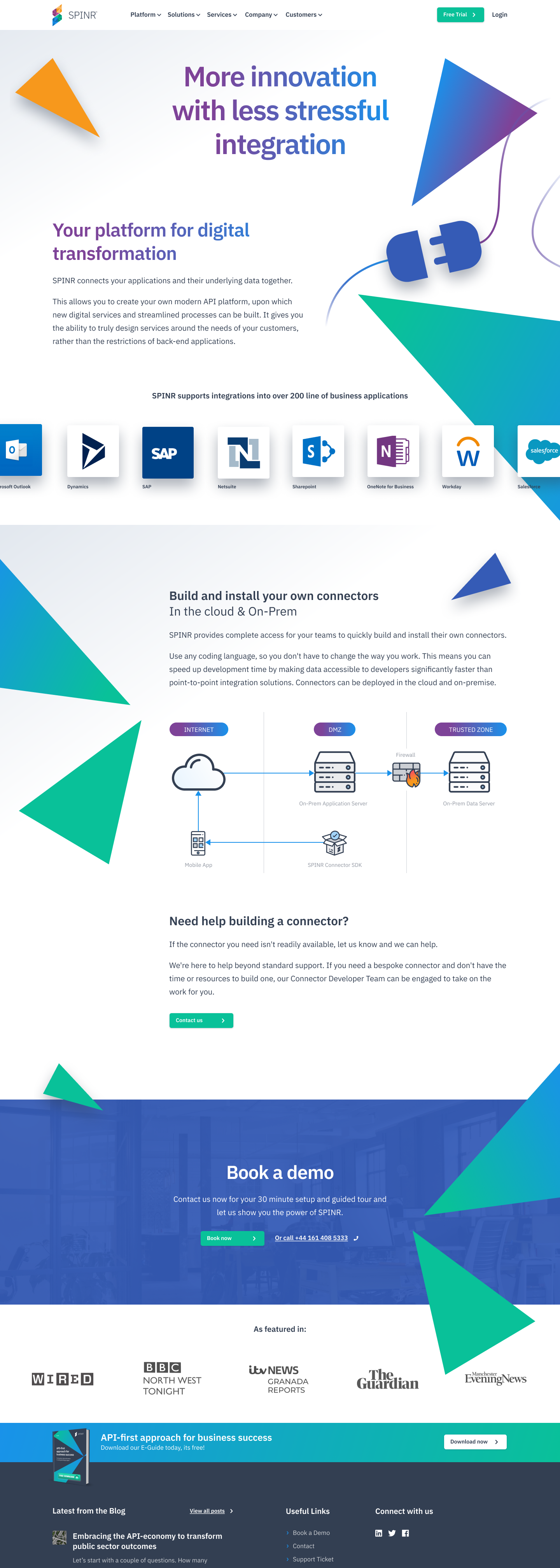
As part of the wider marketing activity, I designed and built the SPINR website. I was responsible for the UX, IA and front end build. I also worked up a rudimentary CMS using forestry.io
I used Zurb Foundation 6 for the front end framework & Jekyll Static site generator to build the site. I hand-coded app.scss and app.js components.
My development environment included Visual Studio Code, Tower, Terminal and Github. I developed on localhost and then mapped a GIT development branch to my staging server and master branch to the live server.

SPINR has gone through multiple rounds of funding and has shown promising traction.
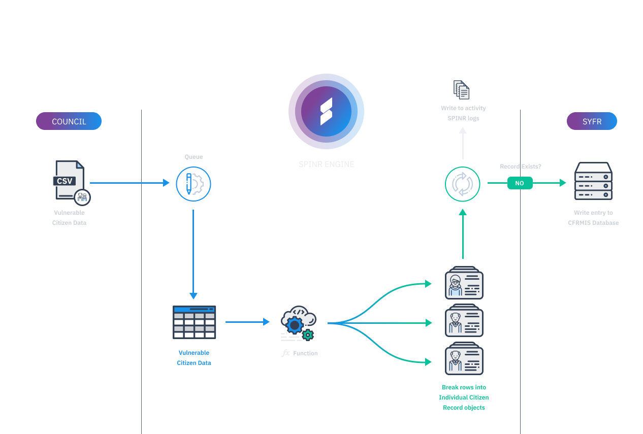
SPINR secured its first customer, SYFR (South Yorkshire Fire & Rescue) in August of last year and is already helping to make massive changes internally. SPINR helped bridge the gap between Barnsley Council and the fire service and they now have an efficient way of sharing data between each other.
SYFR had previously relied on a lot of paper to move information around and SPINR is now helping so much so, that other fire and rescue services nationally are also very interested.
“ Working with SPINR provided a technically brilliant, compliant solution and their willingness to get things done was great. It was also significant that the team at SPINR understood the problem and cared as much about the outcome as we did which made all the difference. ”